Documentation
Note: You can find full documentation here.
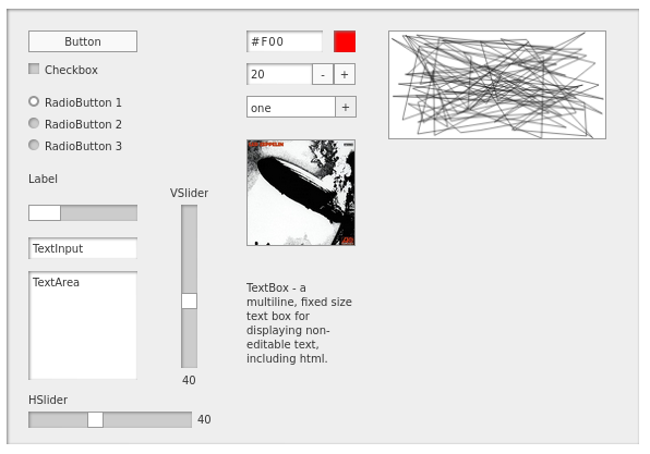
MiniComps is the perfect Web UI toolkit for creating rapid prototypes, experiments, and proof-of-concept projects. They pair well with graphic, animated, interactive or audio creative pieces where you want to put up a quick user interface to control parameters at runtime and focus most of your effort on the creative piece, not the ui.
Most MiniComps can be created, positioned, configured, and hooked up to events all in a single line of code. Example:
const panel = new Panel(document.body, 0, 0, 140, 140);
new Button(panel, 20, 20, "Click me!", () => alert("Thank you!"));
Signature
The signature for most component constructors is very standard:
new ComponentName(parent, x, y, <other possible params>, defaultEventHandler);
Usage
There are two ways to use the MiniComps library in your project. As a global library and using JS Modules. Read the Usage section for more on how to set up your project.
Panel
Usually you’ll start by creating a Panel somewhere on the DOM. This isn’t required; you can use any DOM container as a parent (see the Panel documentation for more on this). But a panel provides a nice background and grouping for your ui and makes sure that all of your components can be absolutely positioned within it.
 ;
;
Demos
Check out the functioning demos on the Demos section.