
Constructor
# new HSlider(parent, x, y, label, value, min, max, defaultHandler)
Constructor
Parameters:
| Name | Type | Description |
|---|---|---|
parent |
HTMLElement | The element to add this slider to. |
x |
number | The x position of the slider. Default 0. |
y |
number | The y position of the slider. Default 0. |
label |
string | The text label of the slider. Default empty string. |
value |
number | The initial value of the slider. Default 0. |
min |
number | The minimum value of the slider. Default 0. |
max |
number | The maximum value of the slider. Default 100. |
defaultHandler |
function | A function that will handle the "change" event. |
- Source:
Example
const panel = new Panel(document.body, 20, 20, 200, 200);
new HSlider(panel, 20, 20, "Volume", 50, 0, 100,  event => console.log(event.target.value));
Extends
Classes
Members
# (static) decimals
Default decimals of all HSliders.
- Source:
# (static) handleSize
Default handleSize of all HSliders.
- Source:
# (static) height
Default height of all HSliders.
- Source:
# (static) labelPosition
Default labelPosition of all HSliders.
- Source:
# (static) valuePosition
Default valuePosition of all HSliders.
- Source:
# (static) width
Default width of all HSliders.
- Source:
# decimals
Sets and gets the number of decimals of precision to be used for the slider. This will effect what is shown in the value label as well as the value property of the slider. A decimals value of 0 will display integers only. Negative decimals will round to the nearest power of 10.
- Source:
# enabled
Sets and gets whether or not this component is enabled. Non-enabled components will be faded out and not respond to events.
- Overrides:
- Source:
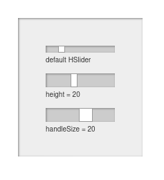
# handleSize
Gets and sets the width of the draggable slider handle. If you make the slider thicker by changing its height, you may want to adjust the handle size as well. If handleSize is the same as the slider height, then the handle will be a square.
- Source:
# height
Sets and gets the height of this component.
- Overrides:
- Source:
# label
Gets and sets the text of the text label of the slider.
- Source:
# labelPosition
Gets and sets the position of the text label displayed on the slider. Valid values are "top" (default), "right", "left" and "bottom". Not applicable to a VSlider.
- Source:
# max
Gets and sets the maximum value of the slider.
- Source:
# min
Gets and sets the minimum value of the slider.
- Source:
# reversed
Gets and sets whether the slider is reversed. A reversed HSlider will show its maximum value on the left and minumum on the right. A reversed VSlider will show its maximum value on the bottom and minimum on the top.
- Source:
# showValue
Gets and sets whether or not the value label will be displayed.
- Source:
# value
Gets and sets the value of the slider.
- Source:
# valuePosition
Gets and sets the position of the value label displayed on the slider. Valid values are "top" (default), "right", "left" and "bottom". Not applicable to a VSlider.
- Source:
# width
Sets and gets the width of this component.
- Overrides:
- Source:
# x
Sets and gets the x position of this component.
- Overrides:
- Source:
# y
Sets and gets the y position of this component.
- Overrides:
- Source:
Methods
# addHandler(handler)
Adds a handler function for the "change" event on this slider.
Parameters:
| Name | Type | Description |
|---|---|---|
handler |
function | A function that will handle the "change" event. |
- Source:
Returns:
This instance, suitable for chaining.
# bind(target, prop)
Automatically changes the value of a property on a target object with the main value of this component changes.
Parameters:
| Name | Type | Description |
|---|---|---|
target |
object | The target object to change. |
prop |
string | The string name of a property on the target object. |
- Source:
Returns:
This instance, suitable for chaining.
# getDecimals()
- Source:
Returns:
the number of decimals of precision will be used for the value.
# getEnabled()
Gets whether the component is enabled.
- Overrides:
- Source:
Returns:
Whether or not the component is enabled.
# getHandlesSize()
- Source:
Returns:
the width of the slider handle.
# getHeight()
Gets the height of the component.
- Overrides:
- Source:
Returns:
The height of the component.
# getLabel()
- Source:
Returns:
the text of the label.
# getLabelPosition()
- Source:
Returns:
the position of the text label.
# getMax()
- Source:
Returns:
the maximum value of the slider.
# getMin()
- Source:
Returns:
the minimum value of the slider.
# getReversed()
- Source:
Returns:
whether or not the slider is reversed (high value on left / bottom, low value on right / top).
# getShowValue()
- Source:
Returns:
whether or not the value label will be shown.
# getValue()
- Source:
Returns:
the current value of the slider.
# getValuePosition()
- Source:
Returns:
the position of the value label.
# getWidth()
Gets the width of the component.
- Overrides:
- Source:
Returns:
The width of the component.
# getX()
Gets the x position of the component.
- Overrides:
- Source:
Returns:
The x position of the component.
# getY()
Gets the y position of the component.
- Overrides:
- Source:
Returns:
The y position of the component.
# move(x, y)
Moves the component to a specified position.
Parameters:
| Name | Type | Description |
|---|---|---|
x |
number | The new x position of the component. |
y |
number | The new y position of the component. |
- Overrides:
- Source:
Returns:
This instance, suitable for chaining.
# rotate(rad)
Rotates the component.
Parameters:
| Name | Type | Description |
|---|---|---|
rad |
number | The number of radians to rotate the component by. |
- Overrides:
- Source:
Returns:
This instance, suitable for chaining.
# rotateDeg(deg)
Rotates the component.
Parameters:
| Name | Type | Description |
|---|---|---|
deg |
number | The number of degrees to rotate the component by. |
- Overrides:
- Source:
Returns:
This instance, suitable for chaining.
# setDecimals(decimals)
Sets the number of decimals of precision to be used for the slider. This will effect what is shown in the value label as well as the value property of the slider. A decimals value of 0 will display integers only. Negative decimals will round to the nearest power of 10.
Parameters:
| Name | Type | Description |
|---|---|---|
decimals |
number | The decimals of precision to use. |
- Source:
Returns:
This instance, suitable for chaining.
# setEnabled(enabled)
Sets the enabled state of this component.
Parameters:
| Name | Type | Description |
|---|---|---|
enabled |
boolean | Whether or not the component will be enabled. |
- Overrides:
- Source:
Returns:
This instance, suitable for chaining.
# setHandleSize(handleSize)
Gets and sets the width of the draggable slider handle. If you make the slider thicker by changing its height, you may want to adjust the handle size as well. If handleSize is the same as the slider height, then the handle will be a square.
Parameters:
| Name | Type | Description |
|---|---|---|
handleSize |
number | The size of the handle. |
- Source:
Returns:
This instance, suitable for chaining.
# setHeight(height)
Sets the height of this component.
Parameters:
| Name | Type | Description |
|---|---|---|
height |
number | The height of this component. |
- Overrides:
- Source:
Returns:
This instance, suitable for chaining.
# setLabel(label)
Sets the label of this slider.
Parameters:
| Name | Type | Description |
|---|---|---|
label |
string | The label to set on this slider. |
- Source:
Returns:
this instance, suitable for chaining.
# setLabelPosition(position)
Sets the position of the text label.
Parameters:
| Name | Type | Description |
|---|---|---|
position |
string | The position to place the text lable: "top" (default), "right", "left" or "bottom". |
- Source:
Returns:
this instance, suitable for chaining.
# setMax(max)
Sets the maximum value of this slider.
Parameters:
| Name | Type | Description |
|---|---|---|
max |
number | The maximum value of this slider. |
- Source:
Returns:
This instance, suitable for chaining.
# setMin(min)
Sets the minimum value of this slider.
Parameters:
| Name | Type | Description |
|---|---|---|
min |
number | The minimum value of this slider. |
- Source:
Returns:
This instance, suitable for chaining.
# setReversed(reversed)
Sets whether the slider is reversed. A reversed HSlider will show its maximum value on the left and minumum on the right. A reversed VSlider will show its maximum value on the bottom and minimum on the top.
Parameters:
| Name | Type | Description |
|---|---|---|
reversed |
boolean | Whether or not this slider will be reversed. |
- Source:
Returns:
This instance, suitable for chaining.
# setShowValue(showValue)
Sets whether or not the value of this slider will be shown.
Parameters:
| Name | Type | Description |
|---|---|---|
showValue |
boolean | Whether or not the value will be shown. |
- Source:
Returns:
This instance, suitable for chaining.
# setSize(w, h)
Sizes the component.
Parameters:
| Name | Type | Description |
|---|---|---|
w |
number | The new width of the component. |
h |
number | The new height of the component. |
- Overrides:
- Source:
Returns:
This instance, suitable for chaining.
# setValue(value)
Sets the value of this slider.
Parameters:
| Name | Type | Description |
|---|---|---|
value |
number | The value of this slider. |
- Source:
Returns:
This instance, suitable for chaining.
# setValueMinMax(value, min, max)
Sets the value, minimum and maximum of this slider.
Parameters:
| Name | Type | Description |
|---|---|---|
value |
number | The value of this slider. |
min |
number | The minimum value of this slider. |
max |
number | The maximum value of this slider. |
- Source:
Returns:
This instance, suitable for chaining.
# setValuePosition(position)
Sets the position of the value label.
Parameters:
| Name | Type | Description |
|---|---|---|
position |
string | The position to place the value lable: "top" (default), "right", left" or "bottom". |
- Source:
Returns:
this instance, suitable for chaining.
# setWidth(width)
Sets the width of this component.
Parameters:
| Name | Type | Description |
|---|---|---|
width |
number | The width of this component. |
- Overrides:
- Source:
Returns:
This instance, suitable for chaining.
# setX(x)
Sets the x position of this component.
Parameters:
| Name | Type | Description |
|---|---|---|
x |
number | The x position of this component. |
- Overrides:
- Source:
Returns:
This instance, suitable for chaining.
# setY(y)
Sets the y position of this component.
Parameters:
| Name | Type | Description |
|---|---|---|
y |
number | The y position of this component. |
- Overrides:
- Source:
Returns:
this instance, suitable for chaining.