Constructor
# new Label(parent, x, y, text)
Constructor
Parameters:
| Name | Type | Description |
|---|---|---|
parent |
HTMLElement | The element to add this label to. |
x |
number | The x position of the label. Default 0. |
y |
number | The y position of the label. Default 0. |
text |
string | The initial text to display in the label. Default empty string. |
Example
const panel = new Panel(document.body, 20, 20, 200, 200);
new Label(panel, 20, 20, "I am a label");
Extends
Classes
Members
# (static) fontSize
Default fontSize of all labels.
# align
Gets and sets the horizontal alignment of the text in the label (left, right, center). This property will be ingored unless autosize is set to false and the label's width is set to a value higher than the actual width of the text.
# autosize
Gets and sets whether or not the size of the label will automatically adjust to fit the text assigned to it. If autosize is true, setting width or align will be ignored.
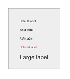
# bold
Gets and sets whether or not the text will be bold.
# color
Gets and sets the color of the text.
# enabled
Sets and gets whether or not this component is enabled. Non-enabled components will be faded out and not respond to events.
- Overrides:
- Source:
# fontSize
Gets and sets the size of the text.
# height
Sets and gets the height of this component.
- Overrides:
- Source:
# italic
Gets and sets whether or not the text will be italicized.
# text
Gets and sets the plain text to be displayed. Compare with the htmlText property.
# width
Sets and gets the width of this component.
- Overrides:
- Source:
# x
Sets and gets the x position of this component.
- Overrides:
- Source:
# y
Sets and gets the y position of this component.
- Overrides:
- Source:
Methods
# getAlign()
Returns:
the alignment of the text.
# getAutoSize()
Returns:
whether or not the label will adjust its size automatically.
# getBold()
Returns:
whether or not the text is bold.
# getColor()
Returns:
the color of the text.
# getEnabled()
Gets whether the component is enabled.
- Overrides:
- Source:
Returns:
Whether or not the component is enabled.
# getFontSize()
Returns:
the font size used in the label.
# getHeight()
Gets the height of the component.
- Overrides:
- Source:
Returns:
The height of the component.
# getItalic()
Returns:
whether or not the text will be italic.
# getText()
Returns:
the text in the label.
# getWidth()
Gets the width of the component.
- Overrides:
- Source:
Returns:
The width of the component.
# getX()
Gets the x position of the component.
- Overrides:
- Source:
Returns:
The x position of the component.
# getY()
Gets the y position of the component.
- Overrides:
- Source:
Returns:
The y position of the component.
# move(x, y)
Moves the component to a specified position.
Parameters:
| Name | Type | Description |
|---|---|---|
x |
number | The new x position of the component. |
y |
number | The new y position of the component. |
- Overrides:
- Source:
Returns:
This instance, suitable for chaining.
# rotate(rad)
Rotates the component.
Parameters:
| Name | Type | Description |
|---|---|---|
rad |
number | The number of radians to rotate the component by. |
- Overrides:
- Source:
Returns:
This instance, suitable for chaining.
# rotateDeg(deg)
Rotates the component.
Parameters:
| Name | Type | Description |
|---|---|---|
deg |
number | The number of degrees to rotate the component by. |
- Overrides:
- Source:
Returns:
This instance, suitable for chaining.
# setAlign(align)
Sets the alignment of the label's text - "left" (default), "right" or "center".
Parameters:
| Name | Type | Description |
|---|---|---|
align |
string | The alignment of the text. |
Returns:
This instance, suitable for chaining.
# setAutosize(autosize)
Sets whether the label will be automatically sized to fit its text.
Parameters:
| Name | Type | Description |
|---|---|---|
autosize |
boolean | Whether the label will be auto-sized. |
Returns:
This instance, suitable for chaining.
# setBold(bold)
Sets wheter or not the text will be bold.
Parameters:
| Name | Type | Description |
|---|---|---|
bold |
boolean | Whether or not the text will be bold. |
Returns:
This instance, suitable for chaining.
# setColor(color)
Sets the color of the text.
Parameters:
| Name | Type | Description |
|---|---|---|
color |
string | The color of the text. |
Returns:
This instance, suitable for chaining.
# setEnabled(enabled)
Sets the enabled state of this component.
Parameters:
| Name | Type | Description |
|---|---|---|
enabled |
boolean | Whether or not the component will be enabled. |
- Overrides:
- Source:
Returns:
This instance, suitable for chaining.
# setFontSize(fontSize)
Sets the font size of the text.
Parameters:
| Name | Type | Description |
|---|---|---|
fontSize |
number | The font size of the text. |
Returns:
This instance, suitable for chaining.
# setHeight(height)
Sets the height of this component.
Parameters:
| Name | Type | Description |
|---|---|---|
height |
number | The height of this component. |
- Overrides:
- Source:
Returns:
This instance, suitable for chaining.
# setItalic(italics)
Sets whether or not the text will be italicized.
Parameters:
| Name | Type | Description |
|---|---|---|
italics |
boolean | Whether or not the text will be italicized. |
Returns:
This instance, suitable for chaining.
# setSize(w, h)
Sizes the component.
Parameters:
| Name | Type | Description |
|---|---|---|
w |
number | The new width of the component. |
h |
number | The new height of the component. |
- Overrides:
- Source:
Returns:
This instance, suitable for chaining.
# setText(text)
Sets the label's text.
Parameters:
| Name | Type | Description |
|---|---|---|
text |
string | The text of the label. |
Returns:
This instance, suitable for chaining.
# setWidth(width)
Sets the width of this component.
Parameters:
| Name | Type | Description |
|---|---|---|
width |
number | The width of this component. |
- Overrides:
- Source:
Returns:
This instance, suitable for chaining.
# setX(x)
Sets the x position of this component.
Parameters:
| Name | Type | Description |
|---|---|---|
x |
number | The x position of this component. |
- Overrides:
- Source:
Returns:
This instance, suitable for chaining.
# setY(y)
Sets the y position of this component.
Parameters:
| Name | Type | Description |
|---|---|---|
y |
number | The y position of this component. |
- Overrides:
- Source:
Returns:
this instance, suitable for chaining.